
We live in an era of visuals (emojis, videos, and memes prevail). This applies to the competitive landscape of grant applications. Using visuals in your grant proposal can be an effective way to communicate information to your reviewer. Visuals can help convey complex ideas into clear, easy to understand designs. Incorporating visuals into your proposal enriches the narrative and engages the reviewer.
Visuals comprise graphic representation of information using elements like charts, tables, graphs, and figures. I’ll share key visualizations for grant proposals, best practices, and a brief resource list to get you started.
Effective Visuals
Visuals can showcase data as proof of success or need, or simply clarify obscure concepts. Though the best visual for a grant proposal varies by applicant and funder, I’ll share common designs that can advance your application.
Flowcharts
Flowcharts help reviewers quickly grasp the sequence of activities, key decision points, and interconnections—things that narrative alone can’t easily express.
These charts are especially useful for presenting methodologies, especially when they’re complex (think projects with multi-phase or multi-arm components). Furthermore, flowcharts can be highly valuable when partners or teams handle distinct phases.
Flowcharts show reviewers that the team has thought through implementation, not just outcomes. This can boost the credibility of your methods and activities.
Tables
Tables work for all kinds of information. They’re especially useful for condensing large data into a clear, organized layout, or when comparing multiple variables or groups—showing patterns and relationships at a glance. If you work in health or social sciences, tables may be useful to summarize eligibility criteria, inclusion/exclusion criteria, or participant characteristics.
When formatting a table in your proposal, ensure it fits on a single page. Use clear, concise headers so the table stands alone without needing the surrounding text. Every table should have a numbered, descriptive title and be clearly referenced in the narrative.
If space is tight, a table can efficiently present narrative information, which may be crucial for proposals with page limits.
Gantt Charts
The most common visual I see is a Gantt chart. These outline project milestones and map activities for the duration of the project, clearly showing key phases and implementation strategies.
Gantt charts signal to a reviewer that you and your team have thought realistically about timelines and resource allocation, demonstrating rigorous planning and clear vision. This helps reviewers quickly assess whether the proposed timeline is feasible, given the scope of work. Be realistic—timelines that feel rushed or unnecessarily drawn out can raise red flags
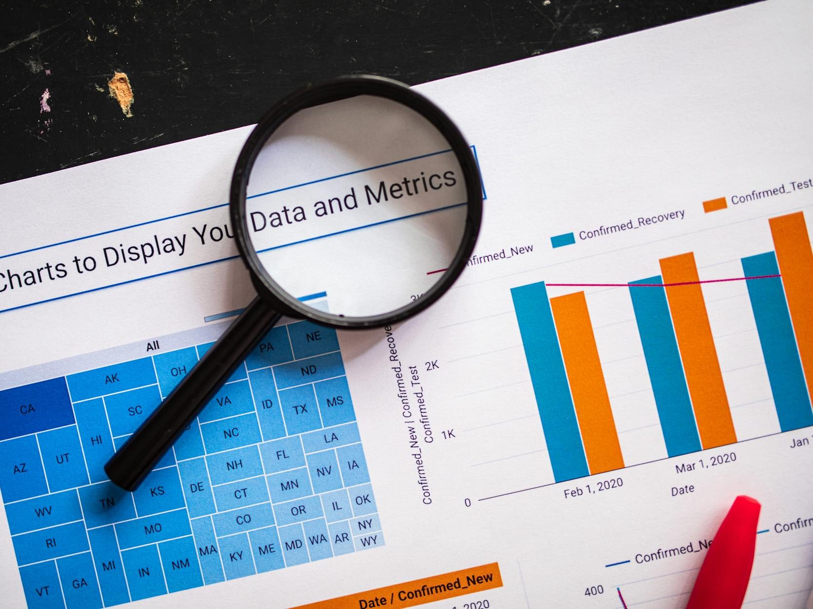
Other types of charts include bar, line, and pie. These can reveal trends over time or comparisons between groups. They’re less common in grant proposals but may just be the right fit for your application.
Best Practices
Use the following as a checklist when working with visuals in your proposal.
- Read the application instructions! If visuals are explicitly inadmissible or the funder has specific formatting requirements, don’t waste time on something that won’t be accepted. When in doubt, contact a grant officer or review examples for that particular funder.
- Add only visuals that truly elevate your proposal. If unsure, have a colleague review your choices.
- Keep it simple. Avoid flourishes, emphasis, or decorative elements. The cleaner your visual, the faster your reviewer will grasp the information.
- Ensure every visual has a clear purpose. Each should complement and enhance the written content rather than repeating information.
- Tie the content of each visual to the funder’s evaluation criteria.
- Number visuals sequentially by type and include a callout in the text.
- Label visuals clearly (axes, legends, captions) to help reviewers understand the significance of the data at a glance.
- If you follow a particular style guide (e.g., APA, AMA, Chicago), read their guidelines on formatting tables and other elements.
- Consider accessibility—some reviewers may be colour-blind or use screen readers. Using clear fonts (serif vs. sans serif) and adding alt text will go a long way. Doing so fosters inclusivity and ensures that all reviewers can engage with the material.
Resources
The following sites and programs may help you build your visuals. I have no official affiliations with any of them (other than finding them useful in my own work). There are, of course, countless other options to suit your needs.
- Canva: user-friendly design platform with templates for charts, timelines, and infographics.
- Microsoft Word: convenient for simple tables and basic SmartArt diagrams.
- Microsoft PowerPoint: flexible for building Gantt charts, flowcharts, and visuals that can be exported as images.
- Google NotebookLM: best for research and note-taking, but can generate data tables and infographics based on text.
- Books: a comprehensive list of books on data visualization for every need https://informationisbeautiful.net/visualizations/dataviz-books/
- Tips from the NIH (US federal health research funder): https://grants.nih.gov/grants-process/write-application/general-grant-writing-tips/tips-for-tables-charts-and-figures. Unfortunately, to date there is nothing similar for Canadian Tri-Agency grant applications.
Reviewers are often pressed for time. Using visuals strategically can strengthen your proposal’s clarity and credibility, easing their workload. Choose each visual with purpose, check that it complements your narrative, and ensure it adds to the context. With a few well-placed visuals, you can demonstrate feasibility and impact—leaving reviewers with a clear understanding of your vision.
Thanks for reading! I’d love to know what resonated with you or any specific components you’d like to learn more about. Leave a comment, use the Contact page, or email me directly. Until next time!
Discover more from jbr editing
Subscribe to get the latest posts sent to your email.
